Tuesday, April 24, 2012

Critique of a Public Place


For my last class blog post I recently got out with my family and visited the Oakdale Mall in Johnson City New York. I have visited this shopping site many times in the past to purchase various things like clothing, gifts, tools, etc. This time I paid closer attention to the signage that was used to direct people to where they want to go(wayfinding). To say the least it was not very impressive when it comes to Information Design and wayfinding signs. As you can see from the various pictures there are many areas for improvement in the area of wayfinding.

Here is a picture of one of the entrances to the shopping mall. As you can see the entrance is clearly visible with the large octagon sign that towers in front of the doors. There are a few other entrances like this located at various places around the perimeter of the complex.

Overall I think the design of this sign is effective. It is contrasting against the building so it provides a good decision point for visitors to make navigational choice.
 If we were to look at reaching our destination in terms of problem solving we can follow Romedi Passini’s process. The process uses three steps: (1)making the decisions and developing the plan of action to reach the desired location; (2) executing the decisions by turning the plan into actions at the decision points along the path; (3) processing information and providing sufficient information to execute decisions.


After entering the building you can see the inviting architecture of the arched ceiling and wide walkways. There is not much navigational signage to be seen at first glimpse. Notice the dinky exit sign located in the top left of the photo. I definetily feel there is room for improvement. Maybe a bigger exit sign and one that goes better with the décor.


  Walking farther ahead about 75-100ft you will see a map of the shopping mall on a lit sign in the middle of the aisle. On the map there is a small yellow triangle that notes “You are here”. Also, the map has legend containing numbers that point out the various shop names and locations. I think this map is effective, but it is also is a bit overwhelming when looking at the list of shops on the top of the sign.


Can you see the restroom sign in this picture on the left? I’ll give you a hint it is in the upper left of the walkway. This restroom sign needs to be bigger and have a directional arrow that will get people’s attention.


As you can see from the few examples, this shopping mall could use some better navigational signage. I believe the signs are too small with except of the outside entrance signs. They are also lacking in color and universal symbols. Also, I would feel somewhat lost if I were a foreign visitor trying to find my way around this place. There is a map available on the mall's website located at: www.oakdalemall.com


References:
Passini, Romedi. Jacobson, Robert. Information Design. Massachusetts: The MIT Press, 2000. Print.

Tuesday, April 10, 2012

More Tools of Design


Creating that perfect image or design that will get the message across can be a daunting task. With today’s computer programs to assist in the creation, the task can get easier or not. There are a few very powerful graphics design software suites available that can assist designers create that perfect image. Adobe Photoshop is a well know graphic design program that has been the choice of many designers because of the vast array of features included. Like most powerful software programs Photoshop comes at a hefty price. I quick search on the web found a free open source program called Gimp that has some of the same features as the expensive Adobe program. During my last semester at SUNY Empire State I took a Digital Art and Design class and became more familiar with the Adobe Photoshop program. Although it was just an introductory course I was still able to make a few designs which I shared on a different blog located
 here --> http://pawsblogplace.blogspot.com/

This was one of the first designs I created while playing around with the various tools within the program.


Here is another design where I was tasked with re-creating a book cover for the DaVinci Code. The design on the left was my first take, while the lower design was enhanced. 


There are also many YouTube videos available that provide tutorials on the functionality of Photoshop and Gimp. Along with various websites that offer steps for beginners to get them started. 


Monday, March 26, 2012

Tools of Information Design


      When it comes to Information Design there are many tools available that help the designers get there ideas into a final product. These tools can be anything from a crayon and poster board to some sophisticated computer software programs. It seems that with the digital information age upon us we are seeing more and more information design tools available for posting information on the internet via webpages. Some of these tools include social media websites like Facebook, MySpace, and twitter. Other examples are blogging tools like Blogger, WordPress, and Blogsome amongst others. For this posting I will go into some detail about the information design tool Blogger.com.

      To start out we need to understand what a Blog is. According to Blogger.com a blog can be anything form a personal diary to news to whatever you what it to be. It is a website that you can post stuff or information that you want to relay to the viewers. Blog can also be used as a free outlet for businesses or artists trying to market their products. Some good examples of blogs with good designs are:


With the Blogger.com Template Designer you can design your blog to make it personal yet effective. You can also choose from many predesigned templates and/or customize them.

Designer Layout:


Design Templates:


I have incorporated the Blogger design tool into my own blogs. I first created the blog and then selected a template that I felt would display my information in a way that would be easy to understand. From time to time I will take another look at my design and tweak it if I feel it needs to change. I have used this approach on this blog and another blog I created for a Digital Art class located here: http://pawsblogplace.blogspot.com/


References:

Blogger. Google.com, 2012. Web. 26 Mar. 2012.


Friday, March 9, 2012

Information Design Process

The process of Information Design contains a few steps to ensure that the design is effective. The first step in the process involves learning about your client. This includes learning everything you can about them in order to discover how they operate. What are their goals, politics, and history? Have they attempted projects like this in the past or is Information Design new to them. Also, who are the key people or person that makes the decisions? What are the requirements and what audiences is the project directed towards?(Baer, 32)

The next step in the process is to create and present a creative brief. The creative brief is a short document that summarizes the information that is important to the project. It is used to get the entire team up to speed on the project background and goals. The brief usually contains four parts. The first part outlines the client and or company information. The next part explains the key project information that needs to be relayed to the team. The third part of the brief highlights the project goals and requirements. The last section outlines the project logistics like deliverables, deadlines, team members and budget. (Baer, 55-56)

The third step in the process of Information Design is determining personas and scenarios. It is an important step in the process that helps the team understand the target audiences better. What can be done to the design to better align it to the audience? Developing personas; brief profiles of users that outline habits, needs, and other attributes.(Baer, 58) Also, applying scenarios along with the personas helps the designers better understand how the audience reacts to the design.

Creating a sitemap is the next step in the process of Information Design. The sitemap is a high level outline of everything that should be part of the project. It helps the team and client view the overall structure of the project.(Baer, 64) Along after the sitemap is the blueprints of the project. The blueprints give more shape to the organized information. The blueprint or sometimes called wireframe is made to look real enough to the end product. It helps the project team and client visualize the end result. It contains a layout that will help point out areas for change or improvement. (Baer, 70)

The last step of the Information design process is the testing. Since the audience is already known from the information gathering step, it is now time to gather some testers that fit into that audience. The testers can use various versions of the end product, like paper prototypes or advanced prototypes.(Baer, 76) The feedback from this testing will let the project team know if the information is being clearly communicated in the design.

In my opinion I feel that the information stage it the most important step of the process. If the project team does not gather enough information about the client, audience, requirements, and goals there is no base for the design. For example if there is no information on who the audience will be creating a design will be like a shot in the dark.

While developing my blog I first try to keep in mind the audience that will be reading it. What are the goals of the audience? How can I make my design simple yet effective? Since there is not a lot of pages in my blog the site map would be really small. Also, I trusted one of the pre-designed templates to organize my information. As far as testing my blog environment I try to picture it as someone from the audience and I let my fellow classmates test my design to see if the information is presented effectively. 


References:

Baer, Kim. “Information Design Workbook: Graphic Approaches, Solutions, and Inspiration”. Massachusetts: Rockport publishers, Inc, 2008. Print

Wednesday, February 22, 2012

The Wayfinding Theory


What is the Wayfinding theory of Information Design?

Everyday people travel from one point to another. This travelling can be as simple as getting from bed to the bathroom or as complex as navigating a vehicle thousands of miles from home to a vacation spot. So how do people get to their destinations without getting lost? They use Wayfinding to assist them on their travels. Wayfinding is the cognitive and behavioral skills related to purposely reaching a physical destination. It includes three major processes, the decision making, the decision execution, and the information processing required to make and execute the decisions. (Jacobsen, 88) Like all theories there are pros and cons.

Pros and Cons


Pros
  • Provides direction in a chaotic world of cities, spaces, complexes and buildings. (Gibson, 13)
  •  Uses simple logic (if here go there, turn right here).
  • Wayfinding does not have to be just signs, can also be architectural and spacial features that guide users. (Jacobson, 90)


Cons:
  • Some people prefer linear/sequential order(Listed Directions) versus a spatial nature(overall picture of the setting) (Jacobson, 89)
  • Not everyone needs the same amount of information thus challenging the designer to have just the right amount to satisfy the majority. (Jacobson, 91)
  •  It is often hard to get the graphic designer and architectural planner to work together. This can create flaws in the design. (Jacobson, 95)
This way for more 
 

How Wayfinding can be used in the blog environment?

I believe wayfinding can be affective in the blog environment. The use of properly designed menus and hyperlinks that provide readers with decision points. These menus will easily direct the users to the information that they desire. Although it is not a physical destination as defined by traditional wayfinding, it is an web or digital destination. 


References:

Jacobson, Robert. Information Design. Massachusetts: The MIT Press, 2000. Print.

Gibson, David. Wayfinding Handbook: Information Design for Public Places. New York: Princeton Architectural Press, 2009. Print


Tuesday, January 31, 2012

What is Information Design?

     What is information design? This has been a long debated question. My understanding of information design is the organization and/or display of information. This organization of information should easily to convey the desired message of the designer. Information design can be applied to anything that deals with information. For example road signs, web pages, presentations, documents, directions and etc.

     Jane C Linder and Drew Phelps discuss the importance of information design in the article 'Design' critical in the Information Age. They explain that in the information age getting more information is not the bottleneck, making sense of it is. This is where information design comes in. Well designed information leads to actions, because it is clear, up front, timely and easy to understand when used for the decisions at hand.

     I feel being good at information design may not come easy to most people. You can't just slap together a poster or presentation and expect it to get the message across effectively. It requires communication and analysis. What is the best way to lay the information out, what should we include, what should we not, should it contain graphics and etc. This leads us to the use of visual aides or graphics to get the message across.
In Dan Roam's book Back of the Napkin, he explains the importance of using pictures. Roam says: "Visual thinking means taking advantage of our innate ability to see -- both with our eyes and our mind's eye -- in order to discover ideas that are otherwise invisible, develop those ideas quickly and intuitively, and then share those ideas with other people in a way that they simply "get".'


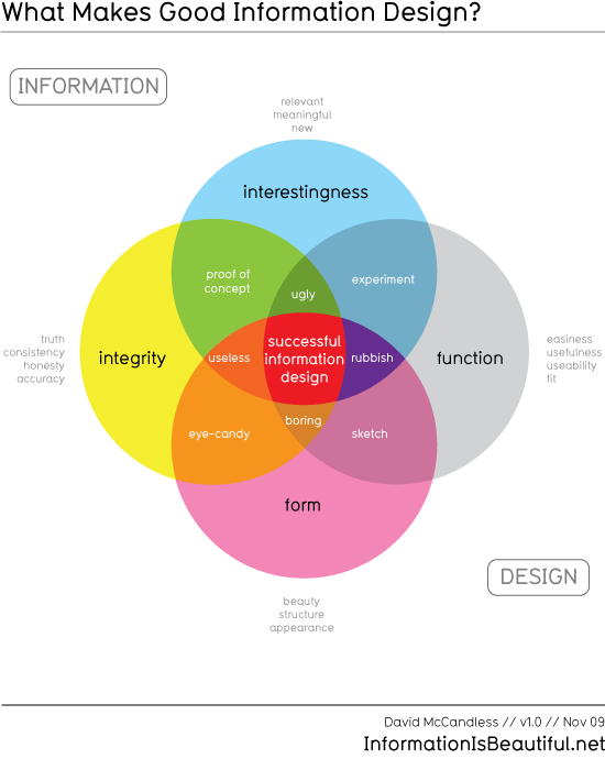
     When searching for a good graphic example of information design I cam across this diagram by David McCandless. It is a good example of information design about information design.

What Makes Good Information Design v 1.0


References:

Linder, Jane C., and Drew Phelps. "Design Critical in Information Age." Computerworld 34.7 (2000):
     34-. ABI/INFORM Complete; ProQuest Research Library. Web. 1 Feb. 2012. 

McCandless, David. "Interesting, Easy, Beautiful, True?." Information is Beautiful. 9 Nov 2009. Web. 1
     Feb. 2012.

Roam, Dan. The Back of the Napkin, solving problems and selling ideas with pictures. New York:
     Penquin, 2009. Print.