Jane C Linder and Drew Phelps discuss the importance of information design in the article 'Design' critical in the Information Age. They explain that in the information age getting more information is not the bottleneck, making sense of it is. This is where information design comes in. Well designed information leads to actions, because it is clear, up front, timely and easy to understand when used for the decisions at hand.
I feel being good at information design may not come easy to most people. You can't just slap together a poster or presentation and expect it to get the message across effectively. It requires communication and analysis. What is the best way to lay the information out, what should we include, what should we not, should it contain graphics and etc. This leads us to the use of visual aides or graphics to get the message across.
In Dan Roam's book Back of the Napkin, he explains the importance of using pictures. Roam says: "Visual thinking means taking advantage of our innate ability to see -- both with our eyes and our mind's eye -- in order to discover ideas that are otherwise invisible, develop those ideas quickly and intuitively, and then share those ideas with other people in a way that they simply "get".'
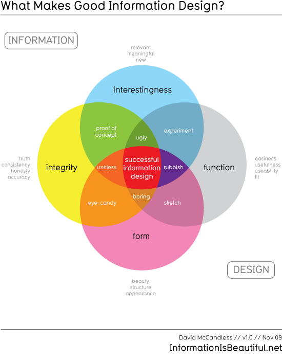
When searching for a good graphic example of information design I cam across this diagram by David McCandless. It is a good example of information design about information design.
References:
Linder, Jane C., and Drew Phelps. "Design Critical in Information Age." Computerworld 34.7 (2000):
34-. ABI/INFORM Complete; ProQuest Research Library. Web. 1 Feb. 2012.
McCandless, David. "Interesting, Easy, Beautiful, True?." Information is Beautiful. 9 Nov 2009. Web. 1
Feb. 2012.
Roam, Dan. The Back of the Napkin, solving problems and selling ideas with pictures. New York:
Penquin, 2009. Print.
Feb. 2012.
Roam, Dan. The Back of the Napkin, solving problems and selling ideas with pictures. New York:
Penquin, 2009. Print.
Hi Patrick,
ReplyDeleteI always appreciate light colored text over a dark background. It's more eye-catching to me than the opposite. You've kept things really simple. Your fonts are very easy to read. The feeling evoked in me from your blog is one of fairly raw information. There isn't much here textually or visually, and while I feel it gets the point across, I wonder if you might consider elaborating more, either with the addition of graphic elements or further text on the subject. Your work illustrates that you have an understanding of what information design is. I feel that the blog is well balanced, and your text answers the appropriate question. I feel that the simplicity of your blog is great, but continue to feel that further visual elements could significantly enhance its visual appeal as well as message.
Nice work,
Wendy Gibson
Nice start, the simplicity helps keep the focus where you want it. I am unfortunately easily distracted, as I am a big fan of gadgets that keep me informed on my computer(temp, data transfer, time, radar for networks available). Keep working at it, and it'll develope as time goes on.
ReplyDelete~Chad~
Thank you Wendy and Chad for the comments. I have made some updates to the blog entry and design. I totally agree that the content was a little lite. I have added content and a design example. I am not sold on the overall design of the blog yet, I may keep poking at it.
ReplyDelete